Video Game Magazine T.O.C.
Conventions
Video game magazines all use a table of contents to show readers what is inside of the issue and where to find specific articles. Gaming magazines all have a few things to their table of contents' that make them all similar.
Examples
Play Station
This Table of Contents from an issue of PlayStation Magazine contains many elements that are repeated through other video game magazines. For instance, there is a large image relating to a video game which is also related to the cover article. We can see on the right there is the cover image and above it there is the title that says Contents. In this instance the main image is overlaid on top of the title which implies that the magazine is consistent with its T.O.C. format. Under the image of the cover there is a list of page numbers and articles. The articles are separated into sections related to what they will be covering or how they are written. The page numbers go before the articles and are differentiated by the different font used for the articles. This magazine uses multiple sans-serif fonts for the articles and page numbers. On the right there are articles listed separately from the other articles with their own images showing that these articles are more important. This magazine also uses a slab-serif font for the page numbers in the main articles with pictures for them. We can also see two puffs detailing articles with large eye-catching numbers with the page numbers.
PC Gamer
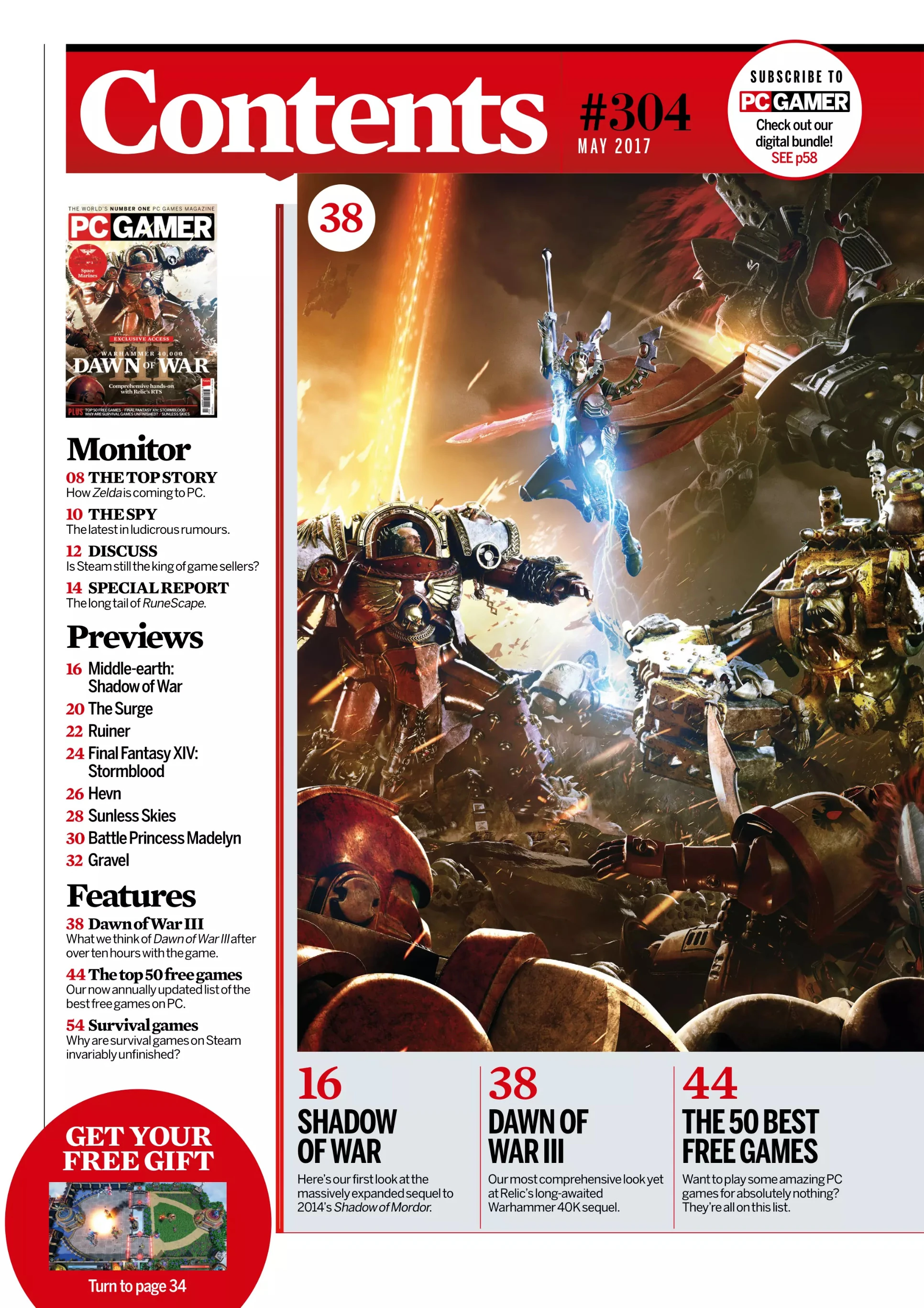
The table of contents for PC Gamer has a well-established formula. There is the top of the page which is always in red and has the word Contents in a white serif font with the issue number in black. The last thing at the top of the page is puff that advertises PC Gamer's digital bundle for subscribing to their publication. On the left there is a column which describes the articles and page numbers for each one. There are different sections that divide the articles, and the title of each section is in a serif font. The column's text is split between serif and sans-serif, serif being used for the section titles and article names and sans-serif being used for descriptors. On the bottom of the page there are three important articles, one of which has to do with the front cover, which is the largest image on the page, the other two articles may have their own images under the large image. On the images there are puffs which have the page number in a red serif font. Some of them have puffs talking about the page to find any exclusive content. The main colors used in the table of contents are red, white, and black. These colors are used because they are the colors in PC Gamer's logo but also because when combined together, they are very vibrant and eye-catching.
Conventions and Characteristics
A convention of Gaming magazine T.O.C.s is that there is usually the word "Contents" at the top of the page. There are usually one or more images, sometimes screenshots but usually promotional art that are related to the articles and placed near their corresponding article. The page numbers are usually placed before the article name and are usually in a different color and/or font to make them visible. The articles are arranged in columns and these columns are typically separated by bold bars of color. There are typically many articles, and the page consists mostly of text. The table of contents will typically have one or two colors used, these colors are usually associated with the brand itself and not with any specific game that is covered in that issue. These color schemes usually consist of one neutral color like black but usually white is used, and another much brighter color which creates a vibrant contrast and brings attention to the important information such as page numbers. When the articles are separated it is most often into sections based on the content of the articles in some way, shape, or form. These sections are given titles which are usually in a different font and/or in a different color. The images used may be overlayed on top of negative space but never over the actual article names or important text that isn't repeated in every issue. Some magazines may also have puffs that have large bold text, usually in all caps to catch the reader's attention.
T.O.C. Sketches
Now I will present my three potential sketches for my magazine's table of contents.
Sketch #1
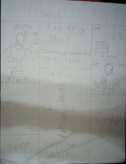
For my first sketch I wanted to do something that was mostly conventional with only a few adjustments. For the title I kept it simple and made an angular text box and put "Contents" as the title. I put one column of articles on the leftmost side of the page. I plan to have the page numbers go first and then the article names. The column is separated into sections which will be based on what the articles entail and how they are written. Under the column of articles, I put two important articles with text describing them underneath. In the middle I put the main article and its page number, and under that I put a large image relating to the main article. I felt that this large image was directly in line with conventions of video game magazines. I put a more angular bottom to the main image and put two images relating to the two important articles on the left side of the page. The images would have their respective page numbers shown in a puff. I felt that this decision did align with conventions because the images are close to the articles so they can be easily connected in the viewer's head. On the right side of the page, I put another column of articles formatted the same way the column on the right will be. I feel like this decision was only partially in line with conventions because in my research of gaming magazine tables of contents having multiple columns and spacing them out was not very common. I also noticed there was a good deal of negative space in the left corner so I put a puff that would advertise an article in the magazine.
Sketch #2
For my second table of contents, I wanted to make this one very in line with the conventions of gaming magazine tables of contents. For the title I wanted to have it centered in the middle of the page but still have the angular design for it to make it look interesting. I put the main article on the left side of the page with its own text box. I put a column of articles under the main article and split it into sections. Under the column I put an image that would be related to one of the important articles. For the main image I put it in the middle of the page large because that was common in my research of tables of contents. The main image would be related to the main article and in this instance, I would want the subject of the main image to be overlaid on top of the text boxes but not enough for it to interfere with understanding. Under the main image I would put two important articles and their page numbers and next to one of the articles I would have an image with no background which would relate to the article. I found that this practice was less common in the modern day but was used prevalently in the past and found it to be very dynamic. On the right I left negative space on the page because I did not want it to be cluttered.
Sketch #3
For this sketch I wanted to make it much different from the other two, so it does not align with conventions very well, but I do feel that it is visually interesting. For the title I put the text box over the whole top of the page with "Contents" in the middle. On the left I put the main image as the largest image on the page with the article's page number on the side. In the bottom left corner, I put an image that will relate to an article. In the middle I put the main article and some text that describes it. Under the main article I put two important articles with their own descriptor text. Under the important articles I put a column of articles split into sections all the way down. On the right I put two images that related to the two important articles. I put a little space under those two images and added another image that will relate to an article in the magazine. The decision to have all of the articles and text in the middle was not very conventional and I had not seen that sort of layout at all during my research. With the images on the side, I felt that there was something very intriguing about how the page was formatted because it did not follow the conventions of video game magazines.
Universal Decisions
There are many aspects of the layout that I left out of the summarizations of the drafts, and this was because these aspects I plan to apply to all of the designs that I choose to use. For the font I plan to use at least two different sans-serif fonts because it will show the contemporary nature of gaming. I will use one sans-serif font to differentiate important text and the other as the regular text. For the color scheme, I plan to use a scheme that complements the masthead because the masthead often acts as the logo and the thing that connects the colors used in the magazine itself in video game magazines. Because my masthead uses black, cyan, and red I think I will be using black for the normal text and cyan for the important text and a little bit of red for some accents such as the puff in Sketch #1. I think that this could be very eye-catching, and the modern cyan color could reflect the modernity of video games. For my main image I intend to use a close up of one of the figures used in my main image to once again capture the feeling of nostalgia. For the two other images I plan to have one important article that will be based around controllers so I will use an image of controllers I have previously taken, and for the other image I plan to have its article focus on a single video game player so I will use a picture of a person.
Conclusion
In conclusion, I plan to use my first sketch because I feel like it remains visually interesting while connecting to the conventions of gaming magazine tables of contents. I feel like the angular and slightly asymmetrical design does not completely align with the conventions, but it makes the magazine feel very modern and new. The overall layout of the table of contents is very in line with the conventions. It uses the large, central main image with two smaller images under it. Each image has a respective article that is organized so that the article titles are close to the images. There are two separate columns that of articles, this is not very common, but I feel that it completes the layout of the page. The puff in the top corner of the page is somewhat off-putting to me so I may change it in the future. All in all, I am very confident for my final layout for my table of confidence.


.png)

No comments:
Post a Comment