Magazine Cover Drafts
Magazine covers are arguably the most important part of magazine design. They are the thing that catches potential customer's eyes and pulls them in. In video game magazines, as I have said before in Conventions and Characteristics of Gaming Magazines the subject is always related to the main topic and is usually artwork of a videogame character. Because I unfortunately did not have access to a professional artist, I had to get creative with my magazine sketches and think ahead on what my main article of the magazine should be about. I came up with two article and cover ideas and made three drafts for each of them.
My first idea for an article and cover was to discuss the differences between a regular controller and a fight stick which is an arcade esc. controller used by fighting game players, since my magazine will focus specifically on fighting video games. The discussion on which is the better controller is a hot topic within the fighting game community.
Draft 1
My idea with this first draft was to have two different controllers with a line down the middle to show the two different sides of the argument. This design does follow a lot of the layout conventions of gaming magazines, but the biggest difference is in the main image. Most gaming magazine covers have a main image that is artwork of a popular video game character, in this case I did not use a video game character and used two video game controllers that are merged into one in this design. The use of video game hardware is uncommon in video game magazine covers but not unheard of, though it is usually to highlight the release of a new console.

The large, centered masthead at the top of the cover is common in video game magazines; the sell line is often found either directly above or below the masthead, in this case I chose above. In my research I have found that many video game magazines include a puff that is an image and then a coverline that advertises something exclusive to the magazine, so I included my own in the lower corner. I put the barcode at the bottom of the page so that it does not take up too much space in the layout. Very few gaming magazine covers put the coverlines right next to the main image and usually use the negative space near it so as to not take away from the image as I have stated before in Conventions and Characteristics of Gaming Magazines. I also included text and an overbar above the coverlines to imply a list of sorts for the final product, which is common in more minimalist gaming magazine covers such as EDGE, which was referenced in my first post. For the font of the main and other coverlines I intend to use a sans-serif font, this will be so that my magazine feel more modern and technologically focused instead of more defined and sophisticated, this choice is also made by many other gaming magazines, as was stated in my Psychology of Fonts post.


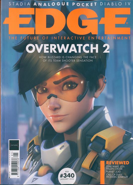
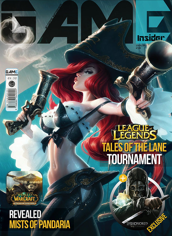
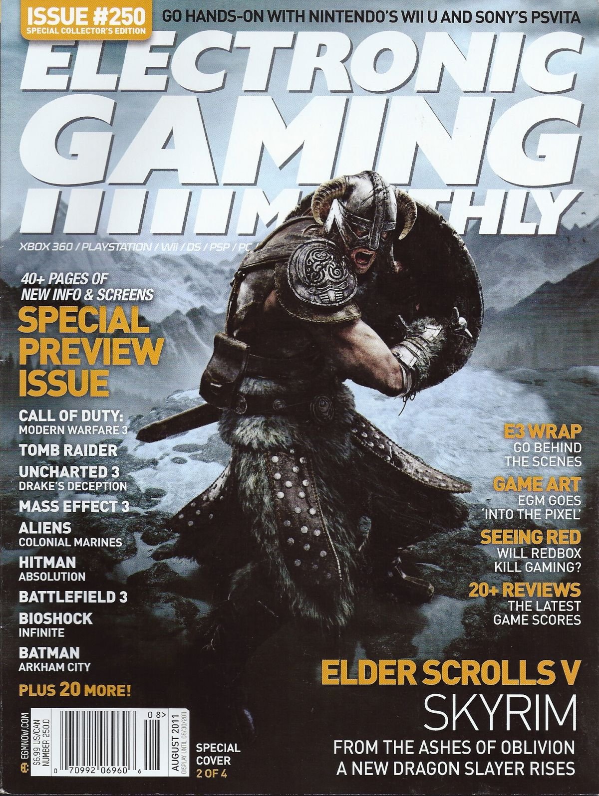
These are some of the images I used as reference for this design, you can see elements of the coverlines, main coverlines and puffs that I used in my own layout sketch.
Draft 2
This draft is very similar to the first, in that it focuses on the two controllers and puts a line between them. A big difference in the main image is that in this image the line separating the two is more jagged, this conveys a more hostile opposition between the two sides. I feel that this hostile feeling adds excitement and intensity to the design. The main coverline being under the main image and the sell line being under the masthead was a choice I made to make this design different from the first although I feel like both of these design choices are more common in gaming magazines. In the placement of the coverlines I put two with text under them in the negative space in between the masthead and image to make that corner feel fuller and put one coverline under the main image and coverline to use up some of the empty space there. I decided to omit a puff in this design because I thought it might clutter the design too much and make it unappealing. I put the barcode in the bottom right corner so that it was not too noticeable. I plan to use a sans-serif font for the reasons listed in the first draft.
Draft 3
I wanted my final design with this idea of regular controllers versus fight sticks to be different than the other two. I did this by putting both controllers in the same setting to make them feel like they are on equal ground. This choice does not show the opposition as well but does show that there is slightly with the main coverline being in between the two controllers. I find that this image does show some contrast between the two subjects with the large, boxy frame of the fight stick and the smooth, slender design of the controller showing some on the surface differences between the two. I placed the two next to each other in the same surroundings because I had seen in done previously with some covers of magazines talking about the console wars or the argument between Sony's PlayStation, and Microsoft's Xbox.

I placed the sell line under the masthead at the top, to stick with the usual gaming magazine conventions. I placed a puff under the masthead and sell line, which would be an image with a corresponding coverline under it. Under the puff I also put two additional coverlines to fill in that side of the page. I would use a sans-serif font for the coverlines because it would represent the intellectual and futuristic elements of the magazine. I put the barcode at the top right side of the cover to break the conventions a little bit. I put a coverline under the barcode to have something else to fill that part of the page. In the bottom right side of the cover a put the date of release because it is usually placed out of the way but still there.


My second idea for an article was how versus fighting games bring out our inner child. To show this, I intend to use two figures of characters that are in a versus fighting game to reference children playing with toys. To explain the basics of what a versus fighting game is to the uninitiated, a versus fighting game is any fighting game that takes characters from another media such as shows, comics, or other video games and pits them against each other in some sort of team fight. Popular examples are Marvel Vs. Capcom, and Dragon Ball FighterZ. These games are very popular among fighting game players.
Draft 4
In the first draft of this idea, I wanted to emulate both, what a kid might see when playing with toys and what someone might see when playing the game Dragon Ball FighterZ. The main image features the subjects which are the two figures standing parallel to each other in a fighting stance. With the subjects being video game characters, this design does fit in more to the conventions of video game magazines but still subverts them somewhat with them being toys instead of illustrated characters. I placed the characters at odds with each other to add excitement and energy to the layout. I put a similar text, overbar and coverline list combination to the first cover draft, to once again emulate the style of EDGE magazine. I put the main coverline over the main image and centered at the same level as the text and coverlines so that it does not take away from the main image. I would use sans-serif font to connect with the technology aspect of gaming. To make my design more minimalist, the only other elements I included were the masthead, sell line, date, and barcode. I put the sell line under the masthead which is at the top of the cover. I put the barcode in the bottom right corner and the date of release right next to it which is a common placement in video game magazines.
Draft 5
In this design I chose to move the masthead to the side of the cover rather than the top to experiment with a different style although most video game magazines have the masthead at the top. This main image is even closer to the conventions of magazine design because it uses a long shot which is common in gaming magazines. The main image is overlayed on top of the masthead to make the character seem larger than life, which is very used often in gaming magazines, as I stated previously in Designing a Magazine.
 I put a coverline with text under it to fill in some of the space in the top right corner. I put a puff that is just a coverline in the left corner, I feel that the main image kind of points towards the puff and leads the eye towards it so it would not need an image to draw attention to it. I put the main coverline in the negative space between the subject's arm and leg to keep it close to the main image. I put two coverlines on the left side of the cover to make use of the negative space. I would use sans-serif font to highlight the modernness of the magazine. I chose to have the barcode and date centered at the bottom of the cover to add a sense of alignment to the layout.


Draft 6
For my final draft of a cover, I chose to focus on the upper body of the toy and tried to lay it out as a more dramatic cover, which in turn could add a comedic effect with the contrast between a serious angle and a child's plaything. I have the main image overlayed above the masthead to make the subject seem larger than life. I put the main coverline over the main image to make sure it is noticeable and readable in the space available with this composition. I dispersed coverlines around the head in the negative space. I would use sans-serif font for the font because it would convey a contemporary feeling that is associated with video games. I put the date above the barcode and put them both in the bottom right corner to bring as little attention to them as possible.
Final Picks
I have chosen two ideas, one for my first idea and one for my second idea.
For my first idea, I chose Draft #3 because I feel like its composition is very appealing because it shows both controllers fully and is not very overwhelming. It still shows that there are two sides somewhat with the main coverline separating the two controllers. The placement of the coverlines is not distracting and matches the placement of the barcode and the other coverline on the right.
For my second idea, I chose Draft #4 because I feel that it feels very alive like the characters could start fighting at any moment. It brings a lot of focus on the characters with the placement of the main coverline, text, overbar, and coverlines. I like that it is simple and does not try to cluster the cover too much and does not take away from the main image. The placement of the date and barcode makes them visible, but does not take away from the composition at all.
These are the designs that I intend to focus on and the ideas that I intend to develop over the course of making this magazine.


.png)

No comments:
Post a Comment