Color Theory Basics
Color theory is the idea that different combinations of color can affect people's emotions and how they feel about the thing they are viewing. It is especially used by artists and advertisers.
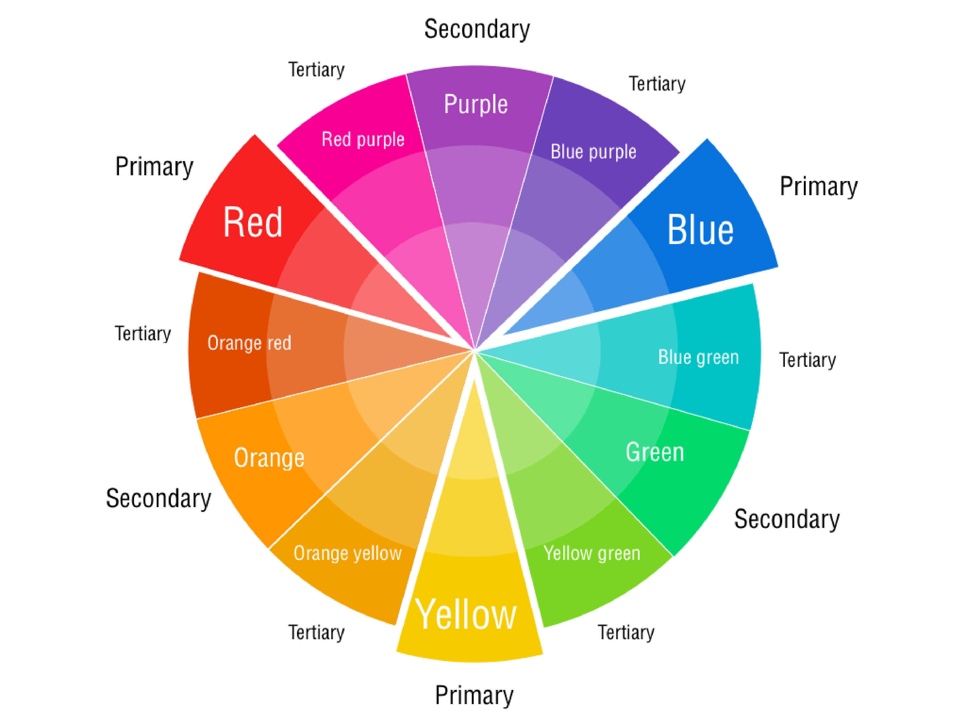
The foundation of color theory is called the color wheel. The color wheel takes the three primary colors-colors that cannot be created by a mixture of different colors-which are yellow, blue, and red. These colors can be mixed to create green (yellow and blue), violet (blue and red), and orange (red and orange), these colors are called secondary colors and are placed in between their respective parent colors on the color wheel. The next group of colors are the tertiary colors, which are combinations of a primary color and a secondary color, these are yellow-green, blue-green, blue-violet, red-violet, red-orange, and yellow-orange, these colors are placed in between their parent colors.
Color wheels can also show the various shades, tints, and tones of each color (or hue). Tints take the base color and add white to it, each tint of the color adds more white to it, which makes the color seem faded. Shades are the like the opposite of tints because shades add black to the base color which makes the color seem dark and deep. Tones take the base color and add grey this creates an effect that diminishes the saturation of the base hue.
Color Combinations
When creating something with a color scheme, it is smart to be mindful of the color wheel to use appealing color combinations. Choosing a specific combination of colors allows for your intentions with the image to remain consistent as well as, your image not becoming clustered and distracting to the viewer.
Monochromatic

Monochromatic color schemes are color schemes that use a single hue and its various shades, tints, and tones to create a harmonious image. The use of a single color in monochromatic images especially evokes the relating feelings and emotions of the color used. In most uses of monochromatic color schemes, the pure color of either white or black are used to separate the monotony somewhat (which seems counterproductive but helps the viewer not get bored and confused by your image). In the example above, the colors blue, black, and white are used.
Complementary
Complementary color schemes use the colors that are opposite from each other on the color wheel to create an image with contrast. Complementary colors are red and green, yellow and violet, and blue-green and red-orange. Complementary colors are used to create a vibrant contrast and usually to bring the viewers' attention to one section of the image because of its contrast from the background.
Split Complementary

Split complementary colors are a subset of complementary colors. When choosing the base hue, instead of picking the color opposite of is on the color wheel, you use the two hues next to it. Split complementary has some of the same aspects of contrast from complementary but overall creates a fuller, well-rounded composition. This example uses orange, blue-green, and green.
Triadic

Triadic color schemes are similar to split complementary and analogous (below), in that they all use three different hues, the difference is in the hues chosen. In triadic color schemes three hues are chosen that are equidistant from each other on the color wheel. Such as red, blue, and yellow, or orange, green, and violet. Triadic color schemes provide contrast from all three hues creating a very vibrant composition. The example above Superman uses a triadic color scheme of red, yellow, and blue.
Analogous
Analogous color schemes use three colors that are closest together on the color. This can create a harmonious effect similar to a monochromatic color scheme but has one key difference in that analogous color schemes use three separate hues (one dominant hue and the other two are accents, as to not clutter the image) whereas monochromatic color schemes use variations of one single hue. The two most common analogous color schemes used are warm colors and cool colors.
Warm Colors
A warm color scheme consists of the hues, red, orange, and yellow, with some variation. Warm color schemes create a joyful and depending on which hue is dominant it could convey an exciting mood. Warm colors also coincide with the colors of autumn, so it carries some of the same emotions it does as well. In the example Kung Fu Panda above, red is used as the dominant hue and yellow and orange are the accents.
Cool Colors
A cool color scheme consists of the hues, blue, violet, and green, with their variations. Cool colors schemes can create a calmer, collected, mood and depending on the dominant color it can even convey sadness. In the example above, the dominant hue is blue-violet with blue, and blue-green as accents.
Tetradic

A Tetradic color scheme uses four hues that are equidistant from each other on the color wheel. One of the more popular tetradic color schemes is, red, blue, yellow-orange, and green. Other potential tetradic color schemes are yellow, blue- violet, red, and green, and blue, orange, yellow-green, and violet. Tetradic color schemes are very balanced and usually create a realistic composition.
Color Meanings
Each color carries a meaning and emotion with it that we as humans associate it with. This is due to our natural desire as humans to attribute human aspects onto nonhuman things.
Red
Red is a color that relates to passion and love as well as, anger and danger. It is a color of intensity, and that intensity is often utilized in advertisements and logos using the color.

Most companies use the passionate and intensity of red for both their logos and advertisements. In the advert example above, we can especially see the use of red for love and passion, it uses the color red, so we associate the product with passion and love. In the Red Bull logo it displays the other side of red, that being the intensity and almost some of the rage in red as well.
Yellow

Yellow is a very joyful color that conveys, optimism, fun, and enjoyment. In the advertisement we can see lots of yellow to show the enjoyment from eating the chips. In the logo we see yellow surrounding the ghost this use of yellow uses the more playful side of the color.
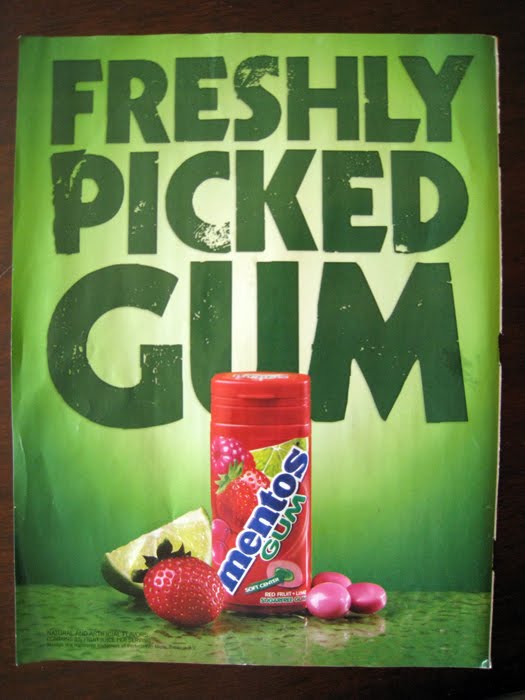
Blue

Blue is a very calm, cool, and trustworthy color. In the advertisement the color blue is used to convey a calming feeling that is then associated with the mint product. In the logo we can see the trustworthy aspect of blue show, because Ford presents itself as an honest and hardworking company it uses the color blue in its logo to show this.
Green, Yellow-Green, and Blue-Green

Green and its variations all have associations with nature because it's the same color as grass, leaves, and vines. Green also has a connection with envy and greed, although it is less used in advertising. In both the advertisement and logo there is an association with nature and purity in the use of the various shades of green.
Orange, Yellow-Orange, and Red-Orange

Orange (named after the fruit) and its variations are invigorating, youthful, and expressive colors. In the advertisement we can see these youthful and expressive tendencies show. In the Amazon logo we can see the energetic and fun side of orange that it inherits from yellow.
Violet, Blue-Violet, and Red-Violet

Violet, and its variations convey intelligence, wisdom, uniqueness, and beauty. In the advertisement above we can see the use of purple to show beauty, and some aspects of individuality. In the logo for Twitch, we can see that purple is used to convey uniqueness, and with the use of font can also show a bit of the intelligence.
Color in Video Game Magazines

Most videogame magazines use bright colors that stick out from the background on their covers. This helps to show the exciting and vibrant nature of gaming as a whole because it is interactive entertainment. This reaches their target audiences better because gaming magazines as a whole have a younger audience and younger audiences tend to be more attracted to vibrant, contrasting colors. Colors like red are especially used because it is a very bright color and typically stands out no matter what colors are included in the composition. Red is used to show the dynamic aspects of gaming and by association the magazine itself.
Canva. “Color Wheel - Color Theory and Calculator | Canva Colors.” Canva’s Design Wiki, 2019, www.canva.com/colors/color-wheel/.
Fanguy, Will. “What Is Color Theory? Meaning & Fundamentals | Adobe XD Ideas.” Ideas, 3 Nov. 2020, xd.adobe.com/ideas/process/ui-design/what-is-color-theory/.
Interaction Design Foundation. “What Is Color Theory?” The Interaction Design Foundation, UX Courses, 2008, www.interaction-design.org/literature/topics/color-theory.
Olesen, Jacob. “Color Meanings - All about Colors and Symbolism.” Color-Meanings.com, 2013, www.color-meanings.com/.

.png)


No comments:
Post a Comment