Friday, February 25, 2022

T.O.C. Feedback and Revision

Table of Contents Feedback and Revision

In this post I will be discussing the feedback I got for my table of contents and which elements I will be changing and incorporating because of it.
This is the original design I am going with and the design that I received feedback on and will be altering in accordance with that feedback.

Feedback

I received feedback from six of my peers, overall, the general consensus was that the organization of the text needed to be adjusted. Some suggested reducing the number of articles, while most suggested to standardize the spacing of the page numbers and articles. This I then realized was a major issue with my design that I would have to fix. With this change, there was another issue that I myself noticed that was not mentioned in any of my feedback which was the two bottom images not being at the same angle nor are their angles even, so I will change this as well.

This is the design with the changes in alignment and spacing of the articles and page numbers. This is a change that I will definitely keep because it does nothing to impede upon the gaming magazine conventions and makes the table of contents look much more professional. 
I received a suggestion from one of my peers to move the articles to create margins at the edge of the page. I attempted this, but ultimately it reduced the quality of the table of contents because it required me to rearrange the text and size down the images in the center which took away from the composition of the article.
I received another suggestion from a peer to reduce the number of articles which, could be plausible but I did not attempt this because it goes against the conventions of gaming magazines' tables of contents.


This last edit I made to the design was to the images, it was not a comment I received but I had previously mentioned in my post, Table of Contents Mockup, that the bottom two images were not even nor were there edges straight and this was something that bothered me personally. I resolved this issue through great trial and error. First, I attempted to combine the images together so I could erase the images at the same time and their edges would be aligned but this still left the issue of the straightness of the edges. Then, I struggled, after that, I found a method of using Windows' Paint 38 to create an area that I wanted to be transparent by first making it white, I created straight edges to the images by using Paint 3D's line tool. Finally, I imported the image into PowerPoint and used the color tool to set the color white as transparent. This also created problems because then I had to change the color of the "WINNER" text in the image on the left to a light gray so that it too did not become transparent. 

Conclusion

This is the final design for my gaming magazine's table of contents, with all of the edits according to peer review and criticism. I think that it works very well with the previously established themes of the Cover and is in line with the conventions that I described in Table of Contents Research and Drafts. I think that in the future I may have to change the color of the text in the second image but for now I think that it does not diminish the professional nature of the layout at all. I have high hopes for the final product of my magazine.

Tuesday, February 22, 2022

Table of Contents Mockup

Table of Contents Mockup

In this post I will be describing the layout of two mockups for my magazine's table of contents. These mockups will be based on Sketches 1 and 2 from my previous post, Table of Contents Research and Drafts.

Mockup #1


In this mockup I based it off of Sketch #1 and tried my best to stick to the original sketch, but some changes had to be made to keep the layout uniform and readable. For the color scheme, which I feel is the most striking aspect of it, I went for cyan, red, and white on a black background. I chose these colors because they were all used in the masthead of the cover and it is in line with conventions for the same colors to be used in the masthead and the table of contents, as I have previously stated in Table of Contents Research and Drafts. Also, as I have said in the same post, I planned for cyan to be the central color of the layout with red being used more as an accent color. If you'll remember, in that post I also said that the black would be the color of the regular text, I changed this because when I made cyan the central color, on the white it did not display the cybernetic/futuristic feel that I wanted it to, so I made the background black and the text white, and the feel of the layout changed entirely for the better. This isn't very common in gaming magazine T.O.C.s but I felt that it was the best decision that could be made and improved the mockup significantly. 
For the images in the middle of the page I wanted to place them there to make them the central focus. I attempted the way I organized the images in my original sketch, but the effect was difficult to accomplish. In the sketch the images on the bottom were diagonal and formed a sort of pentagon between the two of them, this sort of thing was easy to draw out on paper but extremely hard in Canva, I had to use the erase tool to create the angles of each image which is why they appear uneven in the mockup, but I plan to find a way to create a cleaner edge for the final product. 
For the titles of the sections, page numbers, and important articles I colored cyan I chose these items because these were the things that were most often a different color than the normal text as I have said before in Table of Contents Research and Drafts. For the font choices, for normal text I used Canva's Agrandir Tight which is a sans-serif font which I felt highlighted the modernity of a gaming magazine but also had a little bit of playfulness, in the section titles and page numbers I went for Agrandir Tight Medium which was similar to Agrandir Tight but was thicker, so I felt that it created a connection between the normal and important text but was also noticeably different. For the title and important articles, I used the Squada One font which I had previously used for the main coverline of the cover, I felt it conveyed an intelligent and futuristic feeling which worked well with gaming. 
For the placement of the text, I mostly followed my sketch, but when I was creating the second column of articles, the articles I made did not fit correctly on the page, so I raised the column up closer to the top of the page, I was hesitant to do this at first, but I found that it still had the asymmetry I wanted in the layout so that goal was still accomplished. I added a puff according to the sketch I had created and gave it the same article title as the article on page 46 and made the page number large and visible so that it was eye-catching. I placed three puffs with the page numbers of their respective articles on the images each of these puffs and the larger one at the top are in red and the page number puffs have white text, so its colors do not conflict with the images but the puff at the top has black text because it adds more variety to the text in the layout.
This concludes my design choices for the first mockup based on my first sketch for the table of contents.

Mockup #2


In this mockup I based it off of Sketch #2 and almost completely matched the sketch when making it in Canva. The most important part of this layout is the main image, for this I removed the background of the image and then added a picture of the same background without the toy and then overlaid the toy over the background much larger so that it is popping out of its background. I think this creates a very dynamic effect and is very in line with conventions of gaming magazines. For the other two images, I put them in the corners at the bottom of the page near their respective articles. 
For the colors, I used red as the main color in this color scheme, I colored the box for the title "CONTENTS," red, and the important text which is, the section titles, page numbers, and important articles, I did this to bring more attention to the important information. I used black for the normal text to be easily read on the white background. I put a cyan bar in-between the column of articles and the main image because I felt it added a bit of the accent color and worked well with the rest of the layout. I put a cyan puff with the page number of the main article on the main image to add some connection so there wasn't just one cyan colored thing in the layout. 
I used the Roboto Condensed font and emboldened it so that it would be thicker for the title and important articles which makes them seem more prominent in my opinion. I used Roboto font for the normal text which was sans-serif, so it conveyed an intelligent and contemporary feeling which worked with gaming magazines. I made the section titles, and page numbers the Roboto Mono Regular font, I did this because it creates a more uniform look to the text and that it had a very digital aspect to it which worked well with video game magazines. 
This concludes the decisions for Mockup #2 based on the second sketch for the table of contents.

Conclusion

In conclusion, I felt that the two designs I made for the table of contents each follow the conventions of video game magazines as I had described in Table of Contents Research and Drafts. I am most likely going to go with the first mockup for my final product. I feel that there are some hurdles I need to cross to reach the vision I have for it, but I know that in the end it is the best choice to go with that expresses what I want it to in the best way possible. The second draft has some good aspects about it, but I feel that the innovativeness of the black background and white text works so well that I am sure it will turn out much better. In the end, I have high hopes for my final product.

Thursday, February 17, 2022

Images and Original Content

Images and Original Content

In this blog I am going to be discussing how I went about taking photos for the images I plan to use in my magazine's table of contents and the different article titles I will be using and how it relates to the video game magazine genre.

Photos and Edits

I only took a few photos that I want to use for the table of contents. This is because I only plan to use three total pictures in the table of contents. In my Table of Contents Research and Drafts post I said that I will most likely be using my first sketch as the basis for my table of contents. The three photos have corresponding articles which are the main article, the consoles article, and the winner/gamer article (working titles). 

Photo #1


For the first photo I wanted to do the winner/gamer article. For this photo I used an image of myself. The first thing I did was remove the background because an image of the subject standing in front of a door is not very in line with the conventions of gaming magazines.

Next, I attempted to add a background. If you remember my post Cover Photo you will know how much I have struggled with this before. Again, I struggled with finding an appropriate background for the image.
After fiddling with the backgrounds, I realized that I should adjust the size of the image so that it would not show up in Canva as the background but still not making it noticeable that only half of my arm was present.

I tried again with the backgrounds and tried looking for a pattern background this time instead of a gradient and found one that I really liked and thought fit in with the digital nature of video games.

I wasn't entirely liking the red and the different shades of red, but I felt like it would work in the meantime. Then, because I wanted the end product to be a picture of me and the word "Winner," I began trying different fonts that I felt would fit the video game magazine genre. In the end I went with a font in Canva called Norwester which is a sans-serif font which I felt reflected the technological aspect of gaming magazines.
After I did this, I felt like the text did not make the image dynamic enough. So, I used Canva's effects to give the text a shadow and I increased the size of the text to make it even more exciting.
This made the image look much better, but I realized that in this image I am not even smiling. This greatly diminished any of the energetic energy I was trying to get into the image, so I retook the photo, and applied the same effects I did before.

After I dealt with that issue, I decided to tackle the issue of the background once again to figure out which pattern and color might work best.
In the end, I decided on a blue-green color for the background which I felt had a little bit of the intelligence of blue but also had some inherent quality to it that I could not describe that I felt worked really well. I also changed the pattern of the background so that it was still the hexagons which I felt like were very intelligent but had less variation in the shades, so it was not too distracting. This the completely edited version of the photo which will be going into the table of contents.
I plan to put this image under the main image in the middle of the page in accordance with the sketch I planned out in my post Table of Contents Research and Drafts. This image will be connected to an article about a video game tournament winner

Photo #2


For my second image I wanted to edit the image I would use for the main image of the table of contents. I originally planned to use an image I had already taken for the cover photo but the potential photos I had in mind did not meet my specifications, so I decided to take new photos and used the opportunity to add some variety. In this case, because the image was going to be related to the cover photo, I used one of the same toys I used as the subject for this photo, but I changed the background I used.
I added the Eldar Photogenic filter in Canva to get some much needed vibrance to the image’s colors. This makes the image pop much more which is very in line with the conventions of gaming magazines. For this image I am not trying to capture as much of the nostalgic energy I wanted in the cover image, so this is the final edit for this image. 
I plan to place this image in the middle of the page as the main image of the table of contents. This image will be connected to the article about how playing versus games can bring out our inner child.

Photo #3


For my third image, I used a picture I had previously taken for the cover image. This image is of two video game controllers against a gray to black gradient. In my post Cover Photo, I detailed the arduous process of editing this photo and now I plan to make some final adjustments, because as I stated in the post I still felt like after all of the editing I did it was not good enough to be the cover photo.

I started off with increasing the size of the two controllers so that they take up more space and are clearly the focus of the image.
I decided that the controllers were too close together, so I put some space between them. I did this by duplicating the image, removing the background on both images and adding a new background in then cropping out the controller in one photo then cropping out the other controller in the other photo. I felt like with this space between the two controllers the division between them could be clearly expressed without it being too explicit, so this is the final edit for this image.
I plan to place this image under the main image and next to the image of the winner which are both adjacent to their respective articles. This image's article is about comparing and contrasting two controllers often used for playing fighting games.

Article and Section Titles

Section Titles

I plan to have four total sections that the articles will be divided into, and each section will have a distinct title. I chose to use some wordplay when creating the titles that are related to the genre of fighting video games. My first section is called "Frame Advantage". This title uses a term that is common in fighting games which refers to when one player uses a move that is faster than their opponent. I chose this title because I want this section to be the "first looks and early access" articles for the magazine. These sorts of articles are a staple in gaming magazines. My second section is "Reviews," this section is very self-explanatory, each article will focus on the different aspects of a game and then give the game a rating. The point of this section is to inform the audience and is a common practice in the gaming magazine genre. The next section will be called "Rushdown" which is a commonly used term in fighting games but in this case, I am using it as a play on words of rundown which is a word for a summary of information. I plan to have this section contain articles related to the various happenings within the fighting game community. The fourth section will be called "Assessment". For this section I plan to have articles that give the writers opinions on things in the fighting game community as well as just miscellaneous fighting game-related things. The final section is the Features section which will not be explicitly named but it will encompass the important articles of the issue that get their own images in the table of contents.

Article Titles

For the articles I will be pulling from the coverlines I have previously made which you can see in my post, Digital Mockups
For the "Frame Advantage" section I plan to use the article titles as follows: 
12 The Return of Bloody Roar
13Tekken X Street Fighter Finally Back 
15 Them's Fightin' Herds 2
18 The Next Edition of Rivals of Aether. 
For the "Frame Advantage" section I wanted to have the articles feature the titles of the games and a little bit of text so that it could be easily recognizable. 
The "Reviews" section will contain the following article titles: 
21 Guilty Gear Rhexis 
22 Street Fighter 6 
25 King of Fighters 16 
27 Street Fighter Alpha 3: Revitalized 
28 Smash Bros. Absolute 
30 Injustice 3 
32 BlazBlue: Overheld 
34 Samurai Shodown 5. 
For the reviews I wanted to keep the titles simple and just list them as the game titles themselves so as to not distract a reader looking for a specific review.
For the "Rushdown" section the articles are as follows:
37 Tokido's Tournament Win with Juri?!
38 The Mortal Kombat 13 Controversy
40 Marvel VS Capcom 12 Not what Fans Expected
41 Tough Love Arena Gets a PS4 Port
43 Dead or Alive Implements Rollback
46 Fantasy Strike; The Best Game for Newbies?
I wanted the "Rushdown" section to be a lot more laidback in terms of language used, so I did not make it as robotic and focus more on attention grabbing titles, like using questions and exclamation marks.
The "Assessment" section will have the following articles:
49 Bad Netcode; Player, System, or Game?
51 Interview with the New Director of Skullgirls
54 Is it Time for an Art of Fighting Reboot?
55 The Problem with Arena Games
57 An Argument for Zoning
61 Ranked Matches; the Bane of Every Casual
64 Why Anime Games are so Different from Traditional Games
Similar to the "Rushdown" section I wanted the "Assessment" section to use more laidback language. In this case, I wanted the language to be more relaxed because the articles of this section are supposed to be more of opinion pieces and the personal feelings of the writers, so I wanted the titles to reflect that by using things like question marks.
For the "Features" section the article titles are as follows:
6 How Versus Games Bring Out the Child in Us
8 Controller VS Fightstick; Which is Best?
11 Wednesday Night Fights Most Recent Victor
I wanted the "Features" section to be more of a mixed bag when it came to the language used but mostly falling into the more formal range. In the title of the main article, I used the word "Us" which is the first instance of me using first person which I wanted to do to help establish a more personal connection to the audience through this article. The article "Controller VS Fightstick; Which is Best?" is the article I plan to be my two-page spread. This is because the article is one article that I have done a lot of thinking about, and I feel it will be easy to take pictures for the two-page spread.

Conclusion

In conclusion, I feel that all of my images and article titles connect to the conventions of gaming magazines very well. I feel that the images are still subject to change but for now they are very good where they are at. The titles of the articles are great, and I think strongly connect the conventions of video game magazines but in the future, I may add even more titles to fill up more of the page which is a common practice in gaming magazines. I think that the final product for the table of contents will turn out great.


Tuesday, February 15, 2022

Table of Contents Research and Drafts

Video Game Magazine T.O.C. 

Conventions

Video game magazines all use a table of contents to show readers what is inside of the issue and where to find specific articles. Gaming magazines all have a few things to their table of contents' that make them all similar.

Examples

Play Station

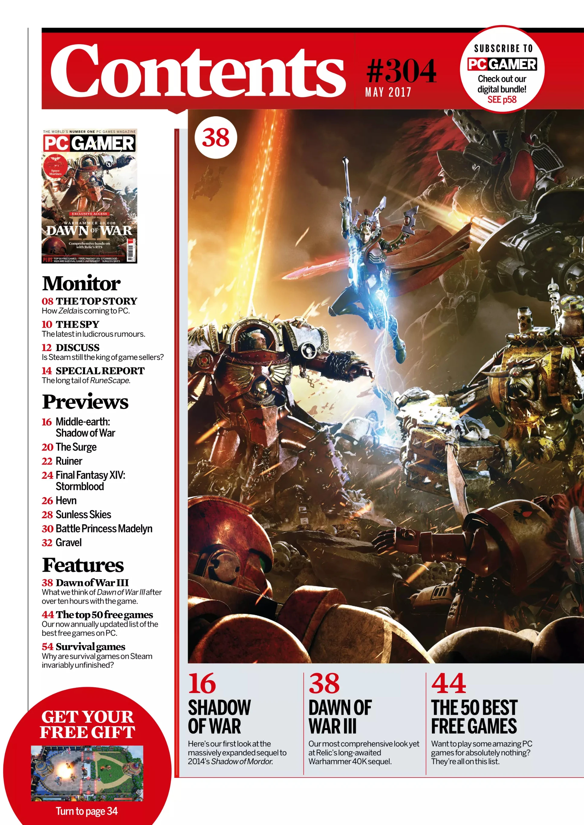
This Table of Contents from an issue of PlayStation Magazine contains many elements that are repeated through other video game magazines. For instance, there is a large image relating to a video game which is also related to the cover article. We can see on the right there is the cover image and above it there is the title that says Contents. In this instance the main image is overlaid on top of the title which implies that the magazine is consistent with its T.O.C. format. Under the image of the cover there is a list of page numbers and articles. The articles are separated into sections related to what they will be covering or how they are written. The page numbers go before the articles and are differentiated by the different font used for the articles. This magazine uses multiple sans-serif fonts for the articles and page numbers. On the right there are articles listed separately from the other articles with their own images showing that these articles are more important. This magazine also uses a slab-serif font for the page numbers in the main articles with pictures for them. We can also see two puffs detailing articles with large eye-catching numbers with the page numbers.


PC Gamer

The table of contents for PC Gamer has a well-established formula. There is the top of the page which is always in red and has the word Contents in a white serif font with the issue number in black. The last thing at the top of the page is puff that advertises PC Gamer's digital bundle for subscribing to their publication. On the left there is a column which describes the articles and page numbers for each one. There are different sections that divide the articles, and the title of each section is in a serif font. The column's text is split between serif and sans-serif, serif being used for the section titles and article names and sans-serif being used for descriptors. On the bottom of the page there are three important articles, one of which has to do with the front cover, which is the largest image on the page, the other two articles may have their own images under the large image. On the images there are puffs which have the page number in a red serif font. Some of them have puffs talking about the page to find any exclusive content. The main colors used in the table of contents are red, white, and black. These colors are used because they are the colors in PC Gamer's logo but also because when combined together, they are very vibrant and eye-catching.

Conventions and Characteristics

A convention of Gaming magazine T.O.C.s is that there is usually the word "Contents" at the top of the page. There are usually one or more images, sometimes screenshots but usually promotional art that are related to the articles and placed near their corresponding article. The page numbers are usually placed before the article name and are usually in a different color and/or font to make them visible. The articles are arranged in columns and these columns are typically separated by bold bars of color. There are typically many articles, and the page consists mostly of text. The table of contents will typically have one or two colors used, these colors are usually associated with the brand itself and not with any specific game that is covered in that issue. These color schemes usually consist of one neutral color like black but usually white is used, and another much brighter color which creates a vibrant contrast and brings attention to the important information such as page numbers. When the articles are separated it is most often into sections based on the content of the articles in some way, shape, or form. These sections are given titles which are usually in a different font and/or in a different color. The images used may be overlayed on top of negative space but never over the actual article names or important text that isn't repeated in every issue. Some magazines may also have puffs that have large bold text, usually in all caps to catch the reader's attention.

T.O.C. Sketches

Now I will present my three potential sketches for my magazine's table of contents.

Sketch #1

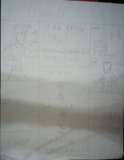
For my first sketch I wanted to do something that was mostly conventional with only a few adjustments. For the title I kept it simple and made an angular text box and put "Contents" as the title. I put one column of articles on the leftmost side of the page. I plan to have the page numbers go first and then the article names. The column is separated into sections which will be based on what the articles entail and how they are written. Under the column of articles, I put two important articles with text describing them underneath. In the middle I put the main article and its page number, and under that I put a large image relating to the main article. I felt that this large image was directly in line with conventions of video game magazines. I put a more angular bottom to the main image and put two images relating to the two important articles on the left side of the page. The images would have their respective page numbers shown in a puff. I felt that this decision did align with conventions because the images are close to the articles so they can be easily connected in the viewer's head. On the right side of the page, I put another column of articles formatted the same way the column on the right will be.  I feel like this decision was only partially in line with conventions because in my research of gaming magazine tables of contents having multiple columns and spacing them out was not very common. I also noticed there was a good deal of negative space in the left corner so I put a puff that would advertise an article in the magazine.

Sketch #2

For my second table of contents, I wanted to make this one very in line with the conventions of gaming magazine tables of contents. For the title I wanted to have it centered in the middle of the page but still have the angular design for it to make it look interesting. I put the main article on the left side of the page with its own text box. I put a column of articles under the main article and split it into sections. Under the column I put an image that would be related to one of the important articles. For the main image I put it in the middle of the page large because that was common in my research of tables of contents. The main image would be related to the main article and in this instance, I would want the subject of the main image to be overlaid on top of the text boxes but not enough for it to interfere with understanding. Under the main image I would put two important articles and their page numbers and next to one of the articles I would have an image with no background which would relate to the article. I found that this practice was less common in the modern day but was used prevalently in the past and found it to be very dynamic. On the right I left negative space on the page because I did not want it to be cluttered.

Sketch #3


For this sketch I wanted to make it much different from the other two, so it does not align with conventions very well, but I do feel that it is visually interesting.  For the title I put the text box over the whole top of the page with "Contents" in the middle. On the left I put the main image as the largest image on the page with the article's page number on the side. In the bottom left corner, I put an image that will relate to an article. In the middle I put the main article and some text that describes it. Under the main article I put two important articles with their own descriptor text. Under the important articles I put a column of articles split into sections all the way down. On the right I put two images that related to the two important articles. I put a little space under those two images and added another image that will relate to an article in the magazine. The decision to have all of the articles and text in the middle was not very conventional and I had not seen that sort of layout at all during my research. With the images on the side, I felt that there was something very intriguing about how the page was formatted because it did not follow the conventions of video game magazines.

Universal Decisions

There are many aspects of the layout that I left out of the summarizations of the drafts, and this was because these aspects I plan to apply to all of the designs that I choose to use. For the font I plan to use at least two different sans-serif fonts because it will show the contemporary nature of gaming. I will use one sans-serif font to differentiate important text and the other as the regular text. For the color scheme, I plan to use a scheme that complements the masthead because the masthead often acts as the logo and the thing that connects the colors used in the magazine itself in video game magazines. Because my masthead uses black, cyan, and red I think I will be using black for the normal text and cyan for the important text and a little bit of red for some accents such as the puff in Sketch #1. I think that this could be very eye-catching, and the modern cyan color could reflect the modernity of video games. For my main image I intend to use a close up of one of the figures used in my main image to once again capture the feeling of nostalgia. For the two other images I plan to have one important article that will be based around controllers so I will use an image of controllers I have previously taken, and for the other image I plan to have its article focus on a single video game player so I will use a picture of a person. 

Conclusion

In conclusion, I plan to use my first sketch because I feel like it remains visually interesting while connecting to the conventions of gaming magazine tables of contents. I feel like the angular and slightly asymmetrical design does not completely align with the conventions, but it makes the magazine feel very modern and new. The overall layout of the table of contents is very in line with the conventions. It uses the large, central main image with two smaller images under it. Each image has a respective article that is organized so that the article titles are close to the images. There are two separate columns that of articles, this is not very common, but I feel that it completes the layout of the page. The puff in the top corner of the page is somewhat off-putting to me so I may change it in the future. All in all, I am very confident for my final layout for my table of confidence.

Tuesday, February 8, 2022

Final Cover

 Final Cover and Revisions

The final round begins as I begin to create the final cover for the magazine. I will continue to use Canva as my editing software for the cover. As I have said in the last post, (Cover Photo) I want to create a cover photo that corresponds with the conventions of video gaming magazines which are listed in my posts Conventions and Characteristics of Gaming Magazines and Designing a Magazine, as well as convey a feeling of childhood memories. I plan to do this by combining the mockup I made and using the image I have edited to my preferences. My main image consists of two toys of video game characters posed as though they were fighting. This connects to the gaming magazine genre because it contains a long shot of video game characters, but it subverts these by not using art created of the characters and using figures instead.

Final Cover Design


I feel that the final cover ended up turning out well and encompassing everything I wanted it to. I ended up making some revisions to both the main image as well as the mockup that I based this cover on, which are detailed below.

Masthead and Sell Line

The masthead I chose to use was the Press Start Squartiqa font from Canva because I felt like it clearly showed that it was a video game magazine. I chose the magazine name BEAT-UP because I felt like it was energetic, made a connection to fighting games as well as a connection to the origins of fighting games: Beat 'Em Up games. I placed it at the top of the page because it was easily readable and that is the place where professional gaming magazines placed their mastheads. For the color of the masthead, I changed it from the mockup I used because I felt that the green clashed too much with the background's green, so I changed it to black, which is much more used in video game magazines, and just made it look better and more readable. I placed the masthead at the top centered because it increased readability and was very common in gaming magazines. I included the sell line because the majority of the video game magazines I came across all had similar sell lines. I came up with a sell line that I felt fit the genre because many video game magazines have sell lines that say a specific niche that they are the best in, in my case magazines covering fighting games. I chose black for the sell line to make it easily readable. I also chose to use some wordplay in the sell line which is very uncommon, but I felt it could enhance the magazine for the target audience because "Fierce" is a term used in fighting games to describe attacks. I placed the sell line under the masthead and to the right because I felt like it made the layout of text more visually interesting to have the text for the sell line off-center.

Main Image

My main image is two toys of fighting game characters in fighting positions. Behind them is a picture of a background similar to the ones used in the game and the characters are evidently standing on a wooden surface. I chose to use my Cover Photo #3 from my post Cover Photo because I felt like in terms of potential for the final cover, #3 just had it over #2 which I felt was too faded to be the main image. Once I selected #3, I made some changes in aspects of the picture which were to increase the brightness slightly as well as increasing the contrast ever so slightly through Canva's adjust tool. I felt that by adjusting these factors I could add more of the feelings of nostalgia as well as professionalism that I described in the post mentioned before. I cropped some of the image when setting it as the background because the wooden surface took up a third of the image originally, so I wanted to cut down on that somewhat. The colors in this image are predominantly cyan/blue and orange with some green and the brown wooden surface. I used these colors in the photo because I felt that the blues and cyan conveyed a sense of intellect while the orange conveyed feelings of childlike imagination. In addition to this, blue and orange are complementary colors which helped the overall design. I placed the image as the background because having the image take up the entire page is very common in video game magazines, but usually the subjects are overlaid on top of the masthead. I chose not to do this because I felt that overlaying the two subjects over the masthead could look awkward and separate the integral parts of the main image and it wouldn't convey nostalgia in the same way. 

Coverlines

My coverlines in this are relatively simple. For my main coverline, I chose a simple descriptive title for the main article. It is placed near the subjects to be more visible and to create a connection between the main coverline and the main image. I used the Game Station Condensed font from Canva for the coverlines as well as the sell line. I used the Squada One font for my main coverline and put in black and gave it a semi-transparent shadow to make it stand out. I used the sans-serif font because I felt it expresses the intelligence of gaming magazines and is very modern video game esc. For the other coverlines I went with a very simplistic design with only a few coverlines and a descriptor with an overbar for the coverlines. The descriptor was "Reviews" and I came up with three video game titles and put them under the overbar. I placed a coverline on the left and right in the Game Station Condensed and Squada One fonts in blue and black. I felt that these additions add a little bit more to the design of the cover so it is not as bland in the upper part of the layout. This method of layout was very common in my research of video game magazines as I stated in Magazine Cover Drafts. I used white for the coverlines and the main coverline because it was easily readable, but I used cyan for "Reviews" as well as the overbar to create a connection to the main image through color. 

Miscellaneous

I added a barcode because most video game magazines are distributed and thus include a barcode to be scanned. I placed the barcode in the bottom right corner because it needed to be noticeable, but I did not want it to be taking away from the main image, so I placed it in negative space. I put the date released as a simple month and year to not clutter the layout and put the date on top of the barcode so that it could be seen but was not taking up too much space. Most video game magazines only contain the date released at most and not the issue number because after many releases the issue number becomes redundant and so I did not include my own issue number in the final cover. 

Conclusion

For my final cover I think that it is very well done. It's layout of text follows most of the gaming magazine conventions, which I talk about in Conventions and Characteristics of Gaming Magazines. The image however follows some conventions but that is due to the feeling I am trying to create through the cover. The overall bright color scheme of the image is not very common in video game magazines, but I feel like that is a necessary part of the childhood memory aspect of it. Toys are seldom used as the main image and the image is usually art of a game character or characters. I feel that since my image does still contain the key aspects of game characters in dramatic poses, it fits with these conventions somewhat but not completely. Nevertheless, I feel like my use of the image expresses exactly the kind of nostalgic feeling that I wanted and when coupled with the layout of text it also captures a very professional feeling which I also wanted. With this post I have completed my cover and feel completely confident about my choices in designing it.

Sunday, February 6, 2022

Cover Photo

 Cover Photo Editing

To create the cover photo for my magazine I will be using Canva to edit pictures I have taken myself. For my cover I have chosen to use the main image of two toy video game characters fighting each other. I had taken other photos for a separate idea which was comparing and contrasting controllers, but I have decided against this idea due to it not being dynamic enough as well as it not fitting in the conventions of the gaming magazine genre.

Cover Photo One

For this first photo I wanted to demonstrate why I did not want to use any of my pictures relating to my article idea of comparing regular controllers and the arcade-esc fight stick. 
To begin I went ahead and removed the background because in my attempt with these photos in my mockups (see Digital Mockups), I felt like the black controllers blended in with the background too much. So, I decided to take a new photo in which I could easily remove the background with Canva's background remover tool.
This worked well and even got rid of the cord on the side of the fight stick which I was worried would still show up after the background was removed. After this I tried adding some solid color backgrounds and was struggling to find one that fit with the image.


In the end I settled on this lavender color because I felt like it went with the intellectual feel I was trying to go for.
After some trial and error, I managed to center the image and began deciding what tools I would use to enhance my image. I first decided I wanted to use a filter to make the image look nicer. I found the Afterglow filter which really appealed to me.
After I applied the filter, I realized that the single-color background was not working for the image. Instead, I started working on creating a new background that went with the image and conveyed a sense of technology and trendiness. 
The first one I tried was having a grey and cyan background with alternating colors which I felt seemed too lifeless behind the image. So, I tried adding some more neon colors.
When I added the neon colors with the black stripe in the middle, I felt that it was energetic but lacked a connection to the actual image.
I added a shadow to the image so that it would look like it was more connected to the background as well as make it seem larger than life, something that is common in gaming magazines. I felt like the colors of the background once again are not working well for the image. So, I changed the background again.

I found this gradient background that went from a dark grey to black, I felt that it went well with the image and did not make the image blend into it which perhaps was because of the editing I did to the main image. But nonetheless, it was a background that captured the intellectual nature of video game magazines.
This was as far as I felt this image could be taken in terms of improving it as well as in aligning it with video game magazine conventions. In the end I still felt that the image was not even close to being good enough for my final cover. 

Cover Photo Two

For my second image I am going with my chosen idea and composition of two figures of video game characters fighting each other. The goal of this cover is to capture the childlike essence of playing with toys, so I want to edit this photo and try to capture some of the nostalgia for the cover without making it look too outdated with the vintage filters. 
This is the image that I started out with. The first thing I did was put on the Auto-Enhance feature of Canva which helps the image look better in general which is important because whenever actual photos are used in video game magazine covers, they are always professional and high-quality. 
For the placement of the image, I want it to be the background of the image because, although most gaming magazines have the subject of the image be overlayed over the masthead, I think that if the two subjects covered the masthead at multiple points it might make it displeasing to the eye. I also felt that separating the subjects from the background could risk losing the nostalgic feelings I am trying to invoke.
The next thing I did was use the blur tool. When I took the photo, I had to use a paperclip to hold up the background image for the subjects. While I was taking photos the paperclip showed up in some of them, so I removed it by blurring it out. This edit, similar to the first, was just to make the image look more professional. 

Next, I started thinking about how I could convey the feeling of reminiscence. I began weighing in my mind the value of creating this feeling as opposed to creating a sense of professionalism more associated with a conventional video game magazine. I can only have them in portions, I do not want one to overpower the other but because the nature of memories of childhood are faded and full of raw emotion, it cannot coexist with the modern and professional gaming magazines in full force. So, I first start out by adding the Photogenic: Retro effect from Canva because the way it makes the image look like an old memory. 
I felt like the image's color scheme was working well because it was relatively simple with blue and orange/brown which I feel connects to the calming and youthful memories with both of these colors (as described in my post, Color Theory). As well as being colors that are complementary to each other.


Then, after trying on what felt like every filter and effect in Canva I found the Photogenic: Luna effect and felt that it really made the colors of the image pop. This is important because, as I've said before in both Codes and Conventions of Gaming Magazines and Color Theory, gaming magazines tend to use bright colors to attract their younger audience.
This is the final edit I made to this image because my goal was to create a modern looking cover that also evoked some feeling of nostalgia which I feel has been achieved by this final image.

Cover Photo Three

For my third image, I wanted to go for a slightly more modern feeling while still having some nostalgia but less than the previous cover photo. The difference between this photo and the previous photo is in the placement of the subjects as the previous photo had the subject on the left only have part of the leg visible and in this photo both subjects' legs are partially cut off at the knee.

The first thing I did was remove the bit of my background-holding apparatus that got in the photo. I did this by using the crop tool because this time the part of ruler that was holding the image got in and was very difficult to blur out. After I did this, I considered cropping part of my desk on which I had taken the photo but decided that it made the picture feel more connected to the childhood memories aspect I wanted to capture.
I used the Auto Enhance tool once again, but this time I felt that the preset 50% intensity was too much for the feel I was going for. To counter this, I turned the intensity down to 40% which I felt was more appealing. 
I then used the Photogenic: Polar filter which I felt made the colors pop. The filter also increased the contrast between the blue and orange which I felt made the image more dynamic, an important feature of gaming magazine covers. 
For the placement of the image, I went with the same as the previous image. No background and having the image take up the entire page. I did this for the same reasons listed above, which are that it could be disorienting to have the masthead covered at two places, it could make the subjects feel much more important than the picture as a whole, and that if the subjects were separated it could risk losing the nostalgic feeling I am trying to create.
This is the final edit I will be making to this image because I feel like it aligns with the conventions of gaming magazines significantly more than the prior image and still has some of the memory-like quality to it.

Conclusion

In the end I have a few thoughts about how my designs can improve, but there are many things I already like about them. For my first photo my feelings on it have not changed throughout this process. I still feel like it is not a dynamic enough photo and will not ever reach a point where it is professional looking and dynamic enough to be considered as the cover. I think that my removing the background and adding a grey-to-black gradient was the best improvement that I could make to the photo. For my second and third photo I feel good about where they are, but I hope that in the future I will be able to merge aspects of both of them to finally have a cover that has both the professionalism and nostalgia that I want in the final cover. For the second image I feel like the filter I put on the image makes it look a little bit too faded which could be detrimental. For the third image I think that the colors are very close to being too bright and displeasing to the eye but for now I feel like it still looks good. I will definitely still make the image take up the entire page and I want to keep the background for the image as I feel it completes the scene that I am trying to create.

Creative Critical Reflection

CCR #1 https://prezi.com/view/CVmvVWlFuPPeSdh9niw9/   CCR#2 https://drive.google.com/file/d/1gww2jzVxPAWQFLX2t0gc67a4jImV4w5d/view?usp=shari...