Saturday, January 29, 2022

Magazine Cover Drafts

Magazine Cover Drafts

Magazine covers are arguably the most important part of magazine design. They are the thing that catches potential customer's eyes and pulls them in. In video game magazines, as I have said before in Conventions and Characteristics of Gaming Magazines the subject is always related to the main topic and is usually artwork of a videogame character. Because I unfortunately did not have access to a professional artist, I had to get creative with my magazine sketches and think ahead on what my main article of the magazine should be about. I came up with two article and cover ideas and made three drafts for each of them.

My first idea for an article and cover was to discuss the differences between a regular controller and a fight stick which is an arcade esc. controller used by fighting game players, since my magazine will focus specifically on fighting video games. The discussion on which is the better controller is a hot topic within the fighting game community.

Draft 1


My idea with this first draft was to have two different controllers with a line down the middle to show the two different sides of the argument. This design does follow a lot of the layout conventions of gaming magazines, but the biggest difference is in the main image. Most gaming magazine covers have a main image that is artwork of a popular video game character, in this case I did not use a video game character and used two video game controllers that are merged into one in this design. The use of video game hardware is uncommon in video game magazine covers but not unheard of, though it is usually to highlight the release of a new console.
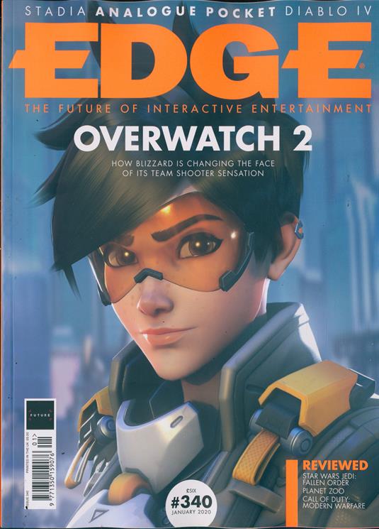
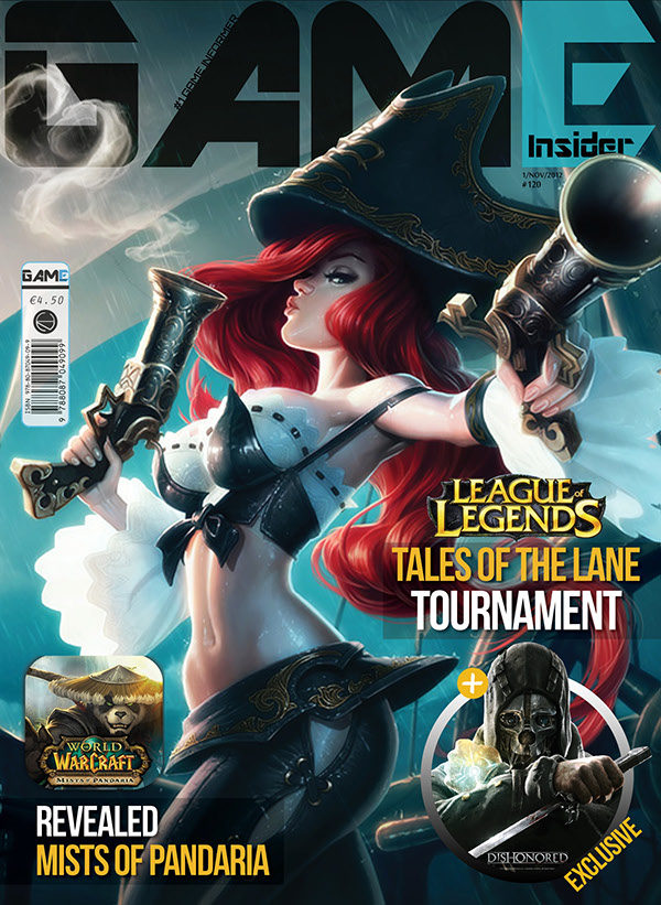
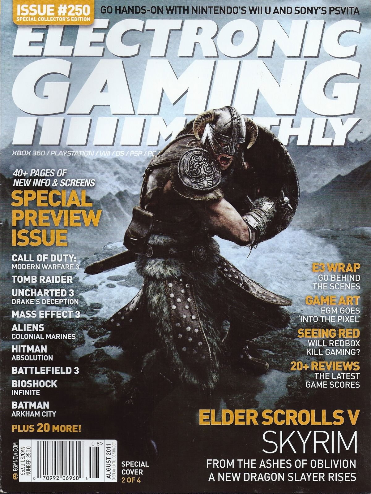
The large, centered masthead at the top of the cover is common in video game magazines; the sell line is often found either directly above or below the masthead, in this case I chose above. In my research I have found that many video game magazines include a puff that is an image and then a coverline that advertises something exclusive to the magazine, so I included my own in the lower corner. I put the barcode at the bottom of the page so that it does not take up too much space in the layout. Very few gaming magazine covers put the coverlines right next to the main image and usually use the negative space near it so as to not take away from the image as I have stated before in Conventions and Characteristics of Gaming Magazines. I also included text and an overbar above the coverlines to imply a list of sorts for the final product, which is common in more minimalist gaming magazine covers such as EDGE, which was referenced in my first post. For the font of the main and other coverlines I intend to use a sans-serif font, this will be so that my magazine feel more modern and technologically focused instead of more defined and sophisticated, this choice is also made by many other gaming magazines, as was stated in my Psychology of Fonts post. 
 

These are some of the images I used as reference for this design, you can see elements of the coverlines, main coverlines and puffs that I used in my own layout sketch.


Draft 2


This draft is very similar to the first, in that it focuses on the two controllers and puts a line between them. A big difference in the main image is that in this image the line separating the two is more jagged, this conveys a more hostile opposition between the two sides. I feel that this hostile feeling adds excitement and intensity to the design. The main coverline being under the main image and the sell line being under the masthead was a choice I made to make this design different from the first although I feel like both of these design choices are more common in gaming magazines. In the placement of the coverlines I put two with text under them in the negative space in between the masthead and image to make that corner feel fuller and put one coverline under the main image and coverline to use up some of the empty space there. I decided to omit a puff in this design because I thought it might clutter the design too much and make it unappealing. I put the barcode in the bottom right corner so that it was not too noticeable. I plan to use a sans-serif font for the reasons listed in the first draft. 

Draft 3

I wanted my final design with this idea of regular controllers versus fight sticks to be different than the other two. I did this by putting both controllers in the same setting to make them feel like they are on equal ground. This choice does not show the opposition as well but does show that there is slightly with the main coverline being in between the two controllers. I find that this image does show some contrast between the two subjects with the large, boxy frame of the fight stick and the smooth, slender design of the controller showing some on the surface differences between the two. I placed the two next to each other in the same surroundings because I had seen in done previously with some covers of magazines talking about the console wars or the argument between Sony's PlayStation, and Microsoft's Xbox.

I placed the sell line under the masthead at the top, to stick with the usual gaming magazine conventions. I placed a puff under the masthead and sell line, which would be an image with a corresponding coverline under it. Under the puff I also put two additional coverlines to fill in that side of the page. I would use a sans-serif font for the coverlines because it would represent the intellectual and futuristic elements of the magazine. I put the barcode at the top right side of the cover to break the conventions a little bit. I put a coverline under the barcode to have something else to fill that part of the page. In the bottom right side of the cover a put the date of release because it is usually placed out of the way but still there.


My second idea for an article was how versus fighting games bring out our inner child. To show this, I intend to use two figures of characters that are in a versus fighting game to reference children playing with toys. To explain the basics of what a versus fighting game is to the uninitiated, a versus fighting game is any fighting game that takes characters from another media such as shows, comics, or other video games and pits them against each other in some sort of team fight. Popular examples are Marvel Vs. Capcom, and Dragon Ball FighterZ. These games are very popular among fighting game players.

Draft 4

In the first draft of this idea, I wanted to emulate both, what a kid might see when playing with toys and what someone might see when playing the game Dragon Ball FighterZ. The main image features the subjects which are the two figures standing parallel to each other in a fighting stance. With the subjects being video game characters, this design does fit in more to the conventions of video game magazines but still subverts them somewhat with them being toys instead of illustrated characters. I placed the characters at odds with each other to add excitement and energy to the layout. I put a similar text, overbar and coverline list combination to the first cover draft, to once again emulate the style of EDGE magazine. I put the main coverline over the main image and centered at the same level as the text and coverlines so that it does not take away from the main image. I would use sans-serif font to connect with the technology aspect of gaming. To make my design more minimalist, the only other elements I included were the masthead, sell line, date, and barcode. I put the sell line under the masthead which is at the top of the cover. I put the barcode in the bottom right corner and the date of release right next to it which is a common placement in video game magazines.

Draft 5

In this design I chose to move the masthead to the side of the cover rather than the top to experiment with a different style although most video game magazines have the masthead at the top. This main image is even closer to the conventions of magazine design because it uses a long shot which is common in gaming magazines. The main image is overlayed on top of the masthead to make the character seem larger than life, which is very used often in gaming magazines, as I stated previously in Designing a Magazine.

 
I put a coverline with text under it to fill in some of the space in the top right corner. I put a puff that is just a coverline in the left corner, I feel that the main image kind of points towards the puff and leads the eye towards it so it would not need an image to draw attention to it. I put the main coverline in the negative space between the subject's arm and leg to keep it close to the main image. I put two coverlines on the left side of the cover to make use of the negative space. I would use sans-serif font to highlight the modernness of the magazine. I chose to have the barcode and date centered at the bottom of the cover to add a sense of alignment to the layout.

Draft 6

For my final draft of a cover, I chose to focus on the upper body of the toy and tried to lay it out as a more dramatic cover, which in turn could add a comedic effect with the contrast between a serious angle and a child's plaything. I have the main image overlayed above the masthead to make the subject seem larger than life. I put the main coverline over the main image to make sure it is noticeable and readable in the space available with this composition. I dispersed coverlines around the head in the negative space. I would use sans-serif font for the font because it would convey a contemporary feeling that is associated with video games. I put the date above the barcode and put them both in the bottom right corner to bring as little attention to them as possible.

Final Picks

I have chosen two ideas, one for my first idea and one for my second idea.
For my first idea, I chose Draft #3 because I feel like its composition is very appealing because it shows both controllers fully and is not very overwhelming. It still shows that there are two sides somewhat with the main coverline separating the two controllers. The placement of the coverlines is not distracting and matches the placement of the barcode and the other coverline on the right. 
For my second idea, I chose Draft #4 because I feel that it feels very alive like the characters could start fighting at any moment. It brings a lot of focus on the characters with the placement of the main coverline, text, overbar, and coverlines. I like that it is simple and does not try to cluster the cover too much and does not take away from the main image. The placement of the date and barcode makes them visible, but does not take away from the composition at all. 
These are the designs that I intend to focus on and the ideas that I intend to develop over the course of making this magazine. 

Thursday, January 27, 2022

Designing a Magazine

Making a Magazine Design

Most magazine genres have a defined look that most of the magazines in the genre follow. To make a magazine that is going to attract your audience you must first catch their eye. Standing out is the first step to setting your magazine apart from the competition. 

Covers

It's important to remember to not clutter your cover with extra colors, images and text. While adding more may seem like a good way to attract attention it is even worse because it makes your cover and by extension your magazine unappealing to the customer. When it comes to cover design, less is more.

Use of color is something you should pay attention to when making your cover. Your cover can look more modern and intriguing if you just use a single splash of color within the main image. By using one color and a mostly mixture of black, white, and grey, the places with the color are brought to the customers' attention and they guide the customer's eyes across the cover. The use of a single splash of color can make your cover more intriguing to the customer. 

Content and Articles

The theme of both your magazine brand as a whole as well as the specific issue is an important thing to keep in mind when making your magazines. As customers come to know your brand it will become increasingly important to stay on brand with each new release. By choosing a single theme for your magazine it allows the magazine to be more established and harmonious. 


Making use of negative space in the layout of your magazine is essential. By using negative space and knowing when not to cluster the page it makes your magazine look more refined. Negative space can also guide you the customer eyes through your article, two-page spread, table of contents, or any other part of the magazine. Negative space is an important tool to guide your customer's eye across the page.

Font choice is imperative in conveying the mood of your magazine. I have covered the meaning behind fonts before so to find which font suits your magazine, check it out. The to summarize the two fonts that are most used Serif and Sans-Serif, serif is useful if you want to seem more regal and refined, sans-serif is nice for a more modern and intellectual look. The fonts of your magazine can subtly convey emotions and personality you want to be associated with your magazine.

Contrast can be a good way to bring the customer's attention to something on the page. By using contrasting elements such as switching up the font for one section or using brighter colors around a subject you can easily tell the viewers where the important things to look at are. Contrast can bring important pieces of content to the viewers' attention.

Video Game Magazine Design

Video game magazine covers typically use cover images with direct eye contact with the customer to engage the audience and make them want to buy the product. Sometimes main images will be looking away from the camera to seem cooler and appeal to the younger audience. Main coverlines typically are in a different font from the other coverlines for the audience to make a distinction between the important coverlines. As I previously stated in the Conventions and Characteristics of Gaming Magazines post the main coverline is usually the name of the game that is the focus of the specific issue, so the font used for the coverline is typically the font used for the title of the game. By doing this, game magazines engage their audience with a connection to the actual games.
Unlike most mainstream magazines, video game magazines tend to shy away from using any wordplay in their coverlines. Often coverlines are simply the title of the game and a short phrase about the article or just a list of video game titles with some sort of descriptor. This is to immediately inform the audience of the array of games that are in the magazine.
The Table of Contents page is usually split into different sections, these sections are the same throughout each issue of the magazine. The sections typically are things such as reviews and first looks as well as things exclusive to each magazine company. The table of contents often includes images of games for the main articles of the issue. This is to engage the audience about the games discussed inside and entice the audience further into buying the magazine.
Two Page Spreads in videogame magazines will typically do a few things, either they disperse images within the article's text, the article will have one page that is an image and one that is the article, or one large image will take up most of one page and part of the other. These different techniques all attract the target audience in the same way, which is by showing the animated and vivid nature of the games and by extension the article and magazine. This technique can also make characters seem larger than life.


Conclusion

The important things to remember are that you should always make sure your magazine stands out from the competition, but don't complicate your layout just to be different. You should keep it simple and make sure your magazine conveys everything you want it to, and it does it well. Video game magazines always want to engage their audience by making their characters stand out and larger than life, and attract customers with a wide array of video game topics.

Filipstojcic. “Gaming Magazine.” SlideShare, 28 Jan. 2016, www.slideshare.net/Filipstojcic/gaming-magazine-57593615.

Fussell, Grace. “10 Tips for Designing High-Impact Magazines.” Design & Illustration Envato Tuts+, 15 June 2020, design.tutsplus.com/articles/10-tips-for-designing-high-impact-magazines--cms-25956. Accessed 24 Jan. 2022.

Gross, Rebecca. “50 Design Techniques That Made These Magazine Covers Awesome [Epic Case Studies].” Learn, Canva, 10 Apr. 2019, www.canva.com/learn/magazine-cover-design/.

Kanti, Adina. “Magazine Design: 9 Incredible Tips You Can Try Now.” MagLoft, 29 June 2018, www.magloft.com/blog/incredible-magazine-design-tips/.

pro-emi. “Magazine Layout Design: Effective Tips & Guide (2020).” PGBS, www.proglobalbusinesssolutions.com/magazine-layout-design/.

RenĂ©e, Karla. “14 Magazine Layout Design Ideas for Your Inspiration.” Lucidpress Blog, 10 May 2021, www.lucidpress.com/blog/14-magazine-layout-design-ideas-for-your-inspiration.

Sunday, January 23, 2022

Color Theory

Color Theory Basics

 Color theory is the idea that different combinations of color can affect people's emotions and how they feel about the thing they are viewing. It is especially used by artists and advertisers.


The foundation of color theory is called the color wheel. The color wheel takes the three primary colors-colors that cannot be created by a mixture of different colors-which are yellow, blue, and red. These colors can be mixed to create green (yellow and blue), violet (blue and red), and orange (red and orange), these colors are called secondary colors and are placed in between their respective parent colors on the color wheel. The next group of colors are the tertiary colors, which are combinations of a primary color and a secondary color, these are yellow-green, blue-green, blue-violet, red-violet, red-orange, and yellow-orange, these colors are placed in between their parent colors. 
Color wheels can also show the various shades, tints, and tones of each color (or hue). Tints take the base color and add white to it, each tint of the color adds more white to it, which makes the color seem faded. Shades are the like the opposite of tints because shades add black to the base color which makes the color seem dark and deep. Tones take the base color and add grey this creates an effect that diminishes the saturation of the base hue. 

Color Combinations

When creating something with a color scheme, it is smart to be mindful of the color wheel to use appealing color combinations. Choosing a specific combination of colors allows for your intentions with the image to remain consistent as well as, your image not becoming clustered and distracting to the viewer.

Monochromatic


Monochromatic color schemes are color schemes that use a single hue and its various shades, tints, and tones to create a harmonious image. The use of a single color in monochromatic images especially evokes the relating feelings and emotions of the color used. In most uses of monochromatic color schemes, the pure color of either white or black are used to separate the monotony somewhat (which seems counterproductive but helps the viewer not get bored and confused by your image). In the example above, the colors blue, black, and white are used.

Complementary


Complementary color schemes use the colors that are opposite from each other on the color wheel to create an image with contrast. Complementary colors are red and green, yellow and violet, and blue-green and red-orange. Complementary colors are used to create a vibrant contrast and usually to bring the viewers' attention to one section of the image because of its contrast from the background.

Split Complementary


Split complementary colors are a subset of complementary colors. When choosing the base hue, instead of picking the color opposite of is on the color wheel, you use the two hues next to it. Split complementary has some of the same aspects of contrast from complementary but overall creates a fuller, well-rounded composition. This example uses orange, blue-green, and green.

Triadic


Triadic color schemes are similar to split complementary and analogous (below), in that they all use three different hues, the difference is in the hues chosen. In triadic color schemes three hues are chosen that are equidistant from each other on the color wheel. Such as red, blue, and yellow, or orange, green, and violet. Triadic color schemes provide contrast from all three hues creating a very vibrant composition. The example above Superman uses a triadic color scheme of red, yellow, and blue. 

Analogous

Analogous color schemes use three colors that are closest together on the color. This can create a harmonious effect similar to a monochromatic color scheme but has one key difference in that analogous color schemes use three separate hues (one dominant hue and the other two are accents, as to not clutter the image) whereas monochromatic color schemes use variations of one single hue. The two most common analogous color schemes used are warm colors and cool colors. 

Warm Colors


A warm color scheme consists of the hues, red, orange, and yellow, with some variation. Warm color schemes create a joyful and depending on which hue is dominant it could convey an exciting mood. Warm colors also coincide with the colors of autumn, so it carries some of the same emotions it does as well. In the example Kung Fu Panda above, red is used as the dominant hue and yellow and orange are the accents.

Cool Colors


A cool color scheme consists of the hues, blue, violet, and green, with their variations. Cool colors schemes can create a calmer, collected, mood and depending on the dominant color it can even convey sadness. In the example above, the dominant hue is blue-violet with blue, and blue-green as accents. 

Tetradic


A Tetradic color scheme uses four hues that are equidistant from each other on the color wheel. One of the more popular tetradic color schemes is, red, blue, yellow-orange, and green. Other potential tetradic color schemes are yellow, blue- violet, red, and green, and blue, orange, yellow-green, and violet. Tetradic color schemes are very balanced and usually create a realistic composition.

Color Meanings

Each color carries a meaning and emotion with it that we as humans associate it with. This is due to our natural desire as humans to attribute human aspects onto nonhuman things.

Red

Red is a color that relates to passion and love as well as, anger and danger. It is a color of intensity, and that intensity is often utilized in advertisements and logos using the color.


Most companies use the passionate and intensity of red for both their logos and advertisements. In the advert example above, we can especially see the use of red for love and passion, it uses the color red, so we associate the product with passion and love. In the Red Bull logo it displays the other side of red, that being the intensity and almost some of the rage in red as well.

Yellow


Yellow is a very joyful color that conveys, optimism, fun, and enjoyment. In the advertisement we can see lots of yellow to show the enjoyment from eating the chips. In the logo we see yellow surrounding the ghost this use of yellow uses the more playful side of the color.

Blue


Blue is a very calm, cool, and trustworthy color. In the advertisement the color blue is used to convey a calming feeling that is then associated with the mint product. In the logo we can see the trustworthy aspect of blue show, because Ford presents itself as an honest and hardworking company it uses the color blue in its logo to show this.

Green, Yellow-Green, and Blue-Green


Green and its variations all have associations with nature because it's the same color as grass, leaves, and vines. Green also has a connection with envy and greed, although it is less used in advertising. In both the advertisement and logo there is an association with nature and purity in the use of the various shades of green.

Orange, Yellow-Orange, and Red-Orange


Orange (named after the fruit) and its variations are invigorating, youthful, and expressive colors. In the advertisement we can see these youthful and expressive tendencies show. In the Amazon logo we can see the energetic and fun side of orange that it inherits from yellow.

Violet, Blue-Violet, and Red-Violet

Violet, and its variations convey intelligence, wisdom, uniqueness, and beauty. In the advertisement above we can see the use of purple to show beauty, and some aspects of individuality. In the logo for Twitch, we can see that purple is used to convey uniqueness, and with the use of font can also show a bit of the intelligence.

Color in Video Game Magazines


 Most videogame magazines use bright colors that stick out from the background on their covers. This helps to show the exciting and vibrant nature of gaming as a whole because it is interactive entertainment. This reaches their target audiences better because gaming magazines as a whole have a younger audience and younger audiences tend to be more attracted to vibrant, contrasting colors. Colors like red are especially used because it is a very bright color and typically stands out no matter what colors are included in the composition. Red is used to show the dynamic aspects of gaming and by association the magazine itself.


Canva. “Color Wheel - Color Theory and Calculator | Canva Colors.” Canva’s Design Wiki, 2019, www.canva.com/colors/color-wheel/.
Fanguy, Will. “What Is Color Theory? Meaning & Fundamentals | Adobe XD Ideas.” Ideas, 3 Nov. 2020, xd.adobe.com/ideas/process/ui-design/what-is-color-theory/.
Interaction Design Foundation. “What Is Color Theory?” The Interaction Design Foundation, UX Courses, 2008, www.interaction-design.org/literature/topics/color-theory.
Olesen, Jacob. “Color Meanings - All about Colors and Symbolism.” Color-Meanings.com, 2013, www.color-meanings.com/.

Wednesday, January 12, 2022

Psychology of Fonts

Introduction

The psychology of fonts is based on the principle that human minds associate human traits to nonhuman objects and things, in this case fonts. 

Serif


Serif font is defined by its changes in line thickness and the strokes that are attached to the ends of longer lines. Serifs represent being intelligent, respectable, dependable, and distinguished. Serif font is used by companies that are established and somewhat regal, to show that they are a reputable company.

Sans-Serif


Sans-Serif font is similar to serif font but, with two key differences: sans-serif lacks the different line widths of serif font, as well as the strokes at the end of lines. Sans-Serif font is more modern than serif, it represents innovation and being open and informal. Sans-serif is used by companies that are more modern such as tac companies like Google, this is due to the contemporary nature of sans-serif.

Script

Script fonts, also called cursive fonts, are any font that imitates actual handwriting. Thus, the different emotions and feelings conveyed by script fonts are varied but generally all script fonts can be personal, creative, and fun. Companies that use script font are varied but some examples are Coca-Cola and Ford, these companies use script font to show the personal grassroots startup of their companies.

Slab Serif

Slab-Serif font is similar to both serif and sans-serif fonts, slab-serif retains the strokes at the end of lines from serif, but also has the constant line width of sans-serif. It is different from both of them though, due to it being bolder than the other serif fonts. With the combination of bold lines with strokes, slab-serif conveys a feeling of stability and power. Slab-Serif is used by the companies Sony and Honda, and it conveys a sense of proudness about the brands.

Display

Display fonts are wide and varied and include essentially every other typeface not discussed above. Display fonts as a whole, convey uniqueness and individuality along with other feelings specific to the typeface.

Video Game Magazines

Most video game magazines use a sans-serif font because it conveys that they are modern and technology-based and usually because they are informing you about games. With the rise of the more modern sans-serif font over serif font in the Age of the Internet it is clear that video game magazines are targeted towards a younger audience between 12-28.

My Thoughts

My magazine will be about video games, so I feel that a more modern font like sans-serif should be my choice. A more futuristic font will aid to the technology aspect of my magazine, though I have found that some video game magazines use display fonts that look more high-tech for important text, I may do the same when making my own magazine.

deBara, Deanna. “The Definition of Font Psychology and How to Use It -.” Canva.com, 2021, https://www.canva.com/learn/font-psychology/.

Fussel, Grace. “The Psychology of Fonts (Fonts That Evoke Emotion).” Design & Illustration Envato Tuts+, 16 May 2020, design.tutsplus.com/articles/the-psychology-of-fonts--cms-34943.

Scott-Smith, Zoe. “Typography Series: What Is a Slab-Serif Font?” Threerooms Branding Agency, 29 May 2019, threerooms.com/blog/typography-series-what-is-a-slab-serif-font#:~:text=Take%20a%20look%20at%20the%20Volvo%2C%20Sony%20and. Accessed 18 Jan. 2022.


Monday, January 10, 2022

Conventions and Characteristics of Gaming Magazines


When it comes to the cover of most gaming magazines, they typically use a picture of a popular video game character as the main image. The main coverline is usually the name of the game that the character in the main image is from and something about the game in smaller text under it. Coverlines are typically placed around the main image where there is negative space. The articles in video game magazines, the main things magazines cover are reviews, interviews with game creators, highlighting games that are going to release, discussion about the video game industry, and in the 90s guides and tips on video games. Typically, writers use gaming terms such as devs, mods, indie, AAA (or triple A), glitch, and UI. The content is used and formatted in a way that captures the target audience, usually coinciding with the majority of videogame players which are young males below 35 but more recently females as well.


PC Gamer is another popular gaming magazine that focuses on, you guessed it, PC games, or games played on a personal computer. PC Gamer also talks about pc gaming related devices and products to maximize a computer's efficiency. PC Gamer's cover always has the masthead in the same font, size and color and usually the main image is overlayed on top of the masthead to make the character in the main image seem larger than life. PC Gamer can do this because they have an established brand and are well known. The main coverline is usually the title of the game from the cover image with the title of the article under it. The magazines have two puffs on the cover, one in the bottom right corner always has the title of an article about pc gaming related devices, such as air coolers and graphics chips, the other puff talks about an article inside the magazine. The other coverlines are placed in the corners of the cover. The placement of the masthead at the top of the paper as well as the multitude of coverlines on the edges of the cover show that this is a magazine intended for American audiences because magazines are displayed with the left half of the cover shown in Europe while in America, they are displayed with the top of the cover shown.

The target audience of PC Gamer is mostly adult men around the age of 20 to early 30s, this is because the magazine focuses on games that use a personal computer and often recommends costly computer hardware, which would require a job to buy. The cover of the magazines appeals to this audience with its detailed artwork, and complex yet consistent layout.


The gaming magazine, Edge, uses a more minimalistic style which typically consists of the large main image, the masthead EDGE, and a single main coverline with an occasional list of the other coverlines or no additional coverlines at all. Edge always puts its selling line "The Future of Interactive Entertainment," under the masthead, and has the edition number and date released in a puff at the bottom. Covers typically use a bright color in the cover or grayscale but always emphasize contrast.  Edge magazines usually have exclusive interviews with developers, reviews of games, and at times exclusive first looks at games not yet released. 

The target audience of Edge is primarily young people from 13-24 because the majority of video game players are in this age range. The bright, dynamic, and simplistic aspects of the covers appeal to this younger audience. The contrasting large masthead catches young audiences' attention.


Charlie512. “Codes and Conventions of a Gaming Magazine.” SlideShare, 21 Sept. 2015, www.slideshare.net/Charlie512/codes-and-conventions-of-a-gaming-magazine.

Filipstojcic. “Gaming Magazine.” SlideShare, 28 Jan. 2016, www.slideshare.net/Filipstojcic/gaming-magazine-57593615.

Creative Critical Reflection

CCR #1 https://prezi.com/view/CVmvVWlFuPPeSdh9niw9/   CCR#2 https://drive.google.com/file/d/1gww2jzVxPAWQFLX2t0gc67a4jImV4w5d/view?usp=shari...